Building a new website for Kaarinan VPK
How a fellow volunteer and I replaced my fire brigade's old WordPress site with a static Astro site, a WCAG AA audit and a typed content model.

Juho Torkkeli
· 10 min read
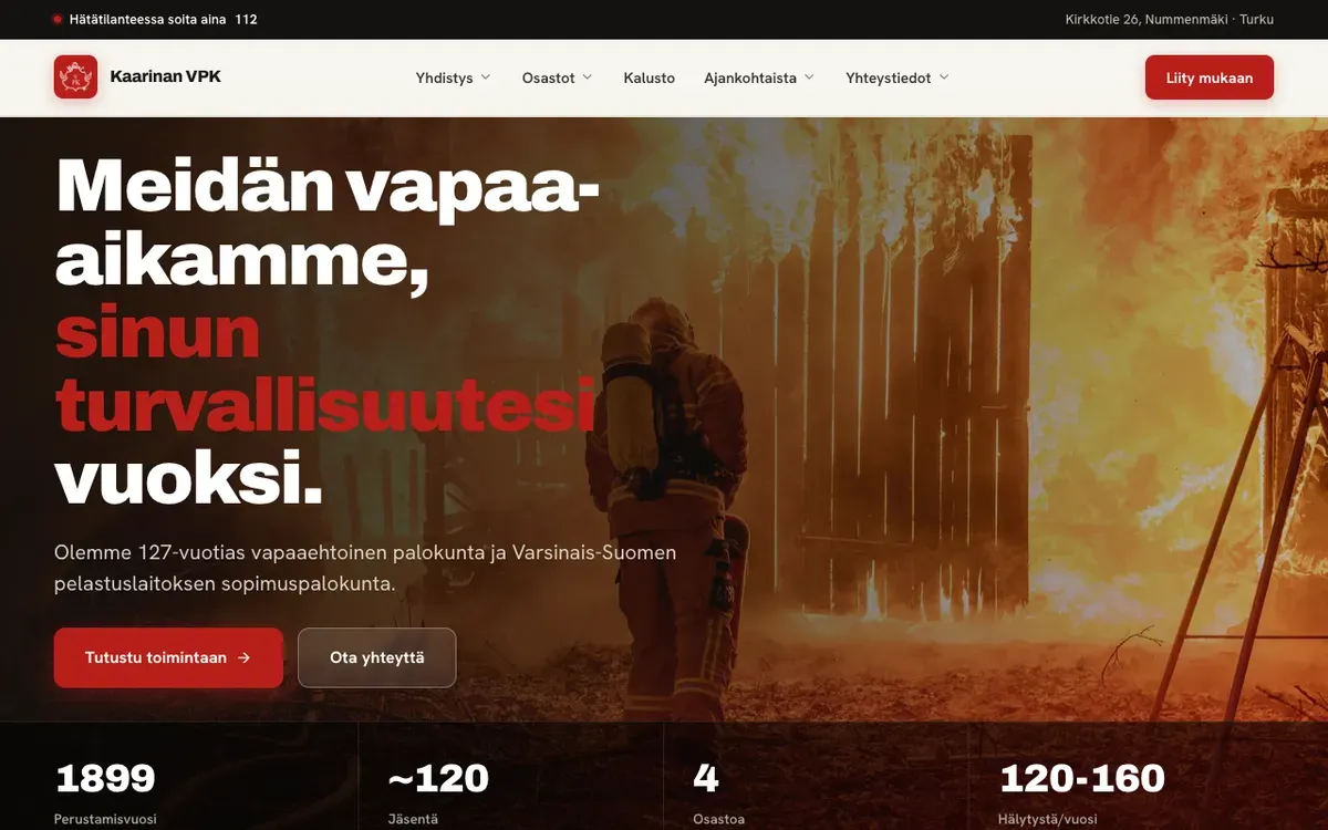
Kaarinan VPK is a volunteer fire brigade in Turku, founded in 1899 (the area belonged to the municipality of Kaarina back then, hence the name). It works under contract with the Southwest Finland rescue department and has about 120 members in four divisions and 120–160 alarms a year.
It’s also my brigade. I’m a smoke diver, a diver and a drone pilot, and I can take any position except unit leader. This summer a fellow volunteer and I built the brigade a new website, live at kaarinanvpk.fi.
Why a new site
We had talked about a new website with the brigade’s IT team for a long time. The old one was a WordPress site that was outdated in content, looks and tech. It was also hard to update, so nobody bothered.
What finally forced the issue was hosting. The old site’s hosting was canceled, and we had about a week to do something about it. Nobody wanted to touch the old WordPress install, so instead of moving it to a new host, we built a new site. When we started, the old .fi site was already down, so the old texts came from a copy on the brigade’s other domain.
Stack and who did what
We wanted something simple and static. We had good experience with Astro, Keystatic and Azure, and we were in a hurry, so we didn’t really consider alternatives.
The result is Astro 7 with MDX content validated by zod, Tailwind CSS v4 and Keystatic as the CMS. It’s hosted on Azure Static Web Apps, and the contact form posts to an Azure Function that sends the email.
We designed the general look together in Claude Design: a dark hero, a red accent and heavy headlines. Starting in June, my fellow volunteer built the core from that design handoff, including the Azure hosting and the email backend.
I started on the code in July and took it from there: general finishing, fixing the looks and getting the site ready for content. In practice that meant the navigation, an accessibility pass, the content model and CMS setup, the equipment and history pages, the form’s front end, a round of iOS Safari fixes, and the first real photos and news.
Navigation, three levels deep
The brigade’s structure is deeper than it looks. The alarm unit has specializations, and the specializations (water supply and drones) have their own pages. On desktop that became hover dropdowns with flyouts, three levels deep.
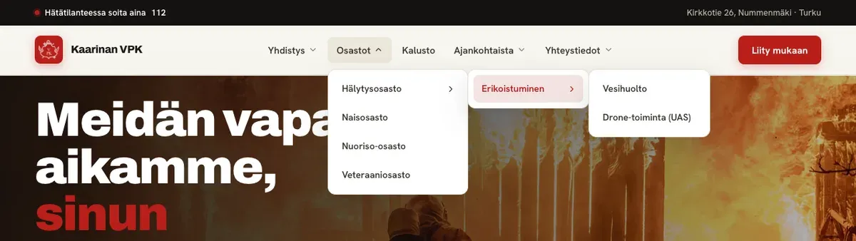
Nested hover menus have a classic problem. When you move the cursor diagonally from a menu item toward its flyout, you cross the neighboring items, and the flyout closes under you. I used the safe-triangle technique, best known from a breakdown of Amazon’s mega dropdown: while the cursor moves inside the triangle between its position and the flyout’s edge, the current flyout stays open. I also added a debug overlay that draws the triangle, which made it much easier to see why a flyout stayed open or closed.
On phones the menu is a full-screen panel, and it works without JavaScript. The burger is a plain link to the panel’s id, and a CSS :target rule opens it. Close is a link to #.
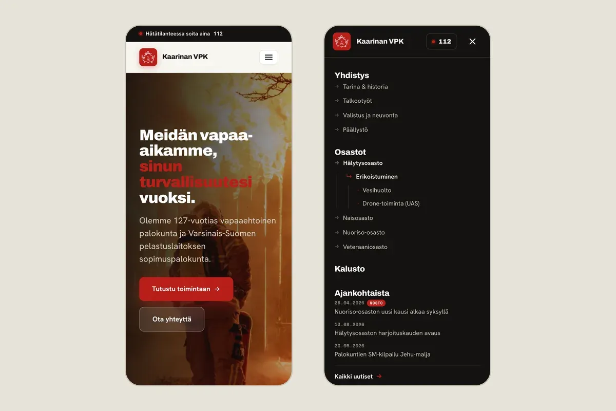
With JavaScript, the script takes over: it intercepts the click, turns the panel into a modal dialog, traps focus, makes the background inert, closes on Escape and returns focus to the burger.
One edge case: if someone loads the page with the menu’s hash already in the URL and JavaScript on, the script has to clear it with a real hash change, because history.replaceState doesn’t update :target.
The principle I applied to every widget: ARIA attributes that promise behavior are added by the same script that implements the behavior. aria-expanded and aria-haspopup on the burger only appear once JavaScript backs them. Without JavaScript the panel is a labeled navigation landmark, not a modal that doesn’t trap focus.
The accessibility pass
Next I audited every route and component against WCAG 2.1 and 2.2 at level AA, working with an LLM. That produced 63 verified findings, and I fixed 55 of them in the same pass. The other eight needed content or integrations that didn’t exist yet, such as real photos and the contact form backend.
Most fixes were unglamorous:
- Headings with fixed sizes from 26 to 74 px clipped on phones, so they became fluid
clamp()values. - Multi-column grids collapse on small screens. After the pass, all 18 routes rendered cleanly at 320 and 360 px wide.
- A skip link, a real breadcrumb
<nav>witharia-current, and visible focus rings everywhere. - 16 px form inputs so iOS doesn’t zoom in,
autocompleteattributes and required-field markers. - 24 px touch targets, and a footer text color adjusted to pass contrast.
A second pass checked each interactive widget against its W3C ARIA Authoring Practices pattern and fixed 19 more keyboard and ARIA issues in the menus, carousels, dialog and timeline.
My main takeaway from working with the LLM is that accessibility still needs a human. The LLM gets lost when it doesn’t have the context it needs. It’s also a rabbit hole: fixing one thing can break another.
Content as data
The first version had a route and a wrapper component per page. I refactored it so content files are pure data: each page is a list of typed sections in YAML frontmatter plus plain Markdown, with no components or imports. The sections validate against a zod discriminated union, and a single catch-all route, [...path].astro, maps each section type to its component. A mistake in a section fails the build instead of rendering a broken page.
To check that a refactor this big didn’t change anything, I compared the full build output before and after. The Finnish pages came out text-identical, apart from the front page news teasers, which had become dynamic.
It also set up the next step. Once pages are typed data, Keystatic can edit them as forms.
Keystatic: set up, not in use yet
The CMS is meant to fix the old site’s problem of being hard to update. Keystatic runs in GitHub mode, so an edit in the admin becomes a commit. The sidebar mirrors the top level of the site’s main navigation, and shared things like contact details and division photos are singletons, edited in one place. The admin only runs with the dev server, which keeps the production build fully static.
It’s set up, but nobody uses it yet.
Three languages, launched in one
The design had English versions of the main pages from the start, and I built the content model for Finnish, Swedish and English.
The first model had a folder per language. That lets translations drift apart: nothing stops the Swedish page from having a different structure than the Finnish one. I tried the alternative on a separate branch first: one entry per page, where every translatable field is a { fi, sv, en } group and the structure (images, paths, section order) exists only once. A missing translation falls back to Finnish and prints a build warning instead of failing. The experiment held up, so it replaced the folder model.
For launch we published Finnish only. That’s one line of config, enabledLocales = ['fi']. The Swedish and English fields stay in the content and in the CMS; they just aren’t built. The language switcher doesn’t render at all when there’s only one language, because a lone “FI” isn’t a choice, it’s a label.
Equipment and history
The equipment cards first looked like blog cards, even though what we have to say about a fire engine is technical data. I replaced the free-text fields with a list of label/value specs (chassis, body, model year, crew, owner). The card renders them as a table whose values line up from card to card.
Each card also opens a dialog with photos, and until then the script had turned the whole card into a button with role="button". A button’s accessible name replaces its content, so that would have hidden the new spec table from screen readers. Now the card stays plain content, and the script lays a transparent button over it to open the dialog.
That change showed the cost of a typed content model with a CMS on top. The new fields had to be mirrored in four places: the zod schema, the Keystatic config, the components and the content.
The history page is a timeline. The founding in 1899 and the present day get cards of their own, and the years in between are grouped into three decade boxes (1900–1950, 1951–1999 and the 2000s) with 19 events as bullets. Every card has a photo carousel.
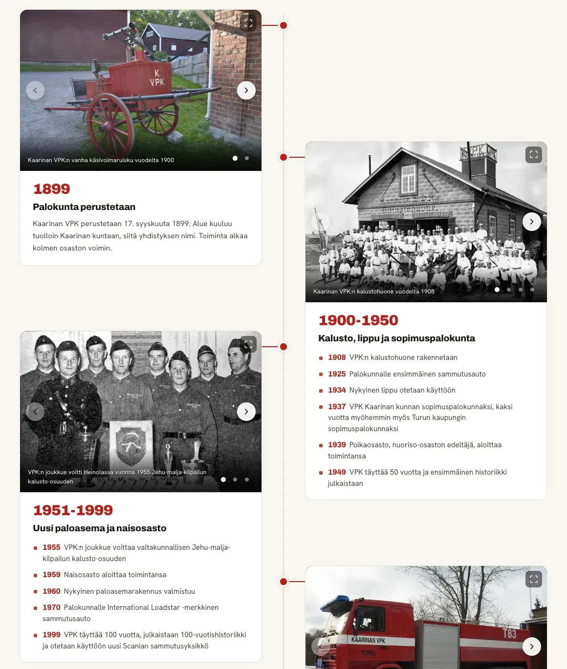
The cards sit in two staggered columns. CSS can’t see a sibling’s height, so a small script keeps the vertical gap between cards in the same column constant. Without JavaScript, a fixed CSS overlap is the fallback, and on phones it’s a single column.
A form that doesn’t lose your message
The join and contact pages share one form component, and I worked on its front end. Before, the result was a single line of text under the form, and nothing visible happened while it was sending. Now the form card has four views: the form, sending, sent and failed.
- Validation runs before anything is sent. Each field gets its own error text (
aria-invalidandaria-describedby), and focus moves to the first invalid field. - While sending, the fields are hidden and the card’s height is locked so the page doesn’t jump.
- The form is never torn down or cleared. After an error, going back to the form brings every field back as it was, so nobody has to retype a message.
- Focus moves to the new panel on every state change. The submit button disappears, and focus must not fall back to
<body>.
One Tailwind gotcha: its display utilities beat the browser’s own [hidden] rule, so without an explicit [hidden] rule for the panels, all four would show on top of each other.
To test the states without sending real email, a query parameter simulates success, failure or a slow send on the dev server. That branch sits behind import.meta.env.DEV, so it doesn’t exist in the production build.
Edge to edge on iOS Safari
The last round of fixes was for iOS Safari. iOS 26 Safari paints the page edge to edge: behind the status bar, under the floating address bar, and in the overscroll area below the footer. On a real device, that color comes from <body>, not from the root element as on desktop WebKit. Our body was paper white, so a white strip showed at both ends of a dark page. The fix was to give <body> the dark edge color and move the paper background to a page wrapper.
On phones the hero now fills the first screen on its own, so the stats row starts below the fold instead of sitting behind the floating address bar. I deliberately left out viewport-fit=cover: it would have forced safe-area padding onto the sticky nav and cost about 59 px of height on iPhones with a notch.
Since launch
People have been linking to the site since it went live, and we’ve had some new members. That’s not purely because of the site, but it has probably helped.